
概要
↓のように、Pardotフォームでレスポンシブ対応する方法をご紹介します。
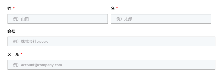
■PC
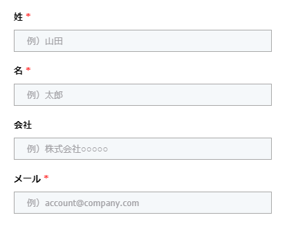
■スマホ
方法
手順①:レイアウトテンプレートのレイアウトに下記を追加
<meta name="viewport" content="width=device-width, initial-scale=1, maximum-scale=1, minimum-scale=1">手順②:CSS内の最外部のBOXに関してwidth指定している部分があれば、max-widthに変更
.pdfrom-content{
    width:800px;
}
↓
.pdfrom-content{
    max-width:800px;
}
手順③:必要に応じて、メディアクエリを記述する
@media only screen and (max-width: 768px) {
	body form.form p.col-left {
		float: none;
		width: 100%;
	}
	body form.form p.col-right {
		float: none;
		width: 100%;
	}
}